This project is for the Spring 2026 Digital Foundations II class, where our task was to create a logo and document our creative process. I chose to design a logo for a friend of mine (who will remain anonymous) as I already have a logo for myself that I am happy with. They have an idea for a company they want to start, named Kludge Laboratories, and wanted to see what I could come up with for a logo. They already have a logo they were working with, so I started there.
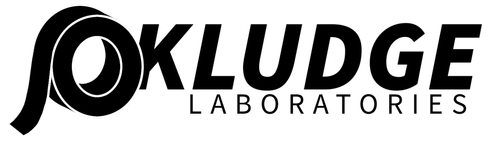
The first things I took note of were the name and logo inspiration. My first thought upon seeing the logo and reading the name was “what is a kludge?” so I went into doing some research. Per Merriam-Webster, a kludge is “a haphazard or makeshift solution to a problem and especially to a computer or programming problem”. Some examples I saw of kludges were a felled bridge with a ramp going across a river, and the CO2 machine quickly thrown together on the Apollo 13 mission. My second thought was that the logo looked familiar, and upon asking I was told that this logo takes after the fictional Aperture Laboratories from the Portal franchise. Aperture Labs is known to have been extremely mismanaged and held together by duct tape, as the saying goes. This logo on its own is already a good interpretation of the inspirations, in my opinion.

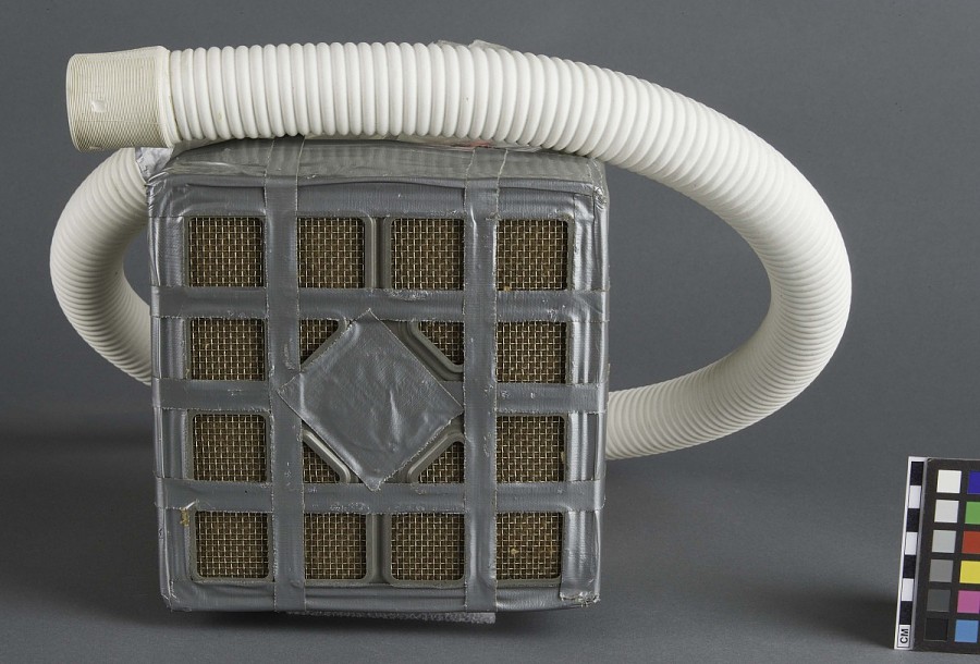

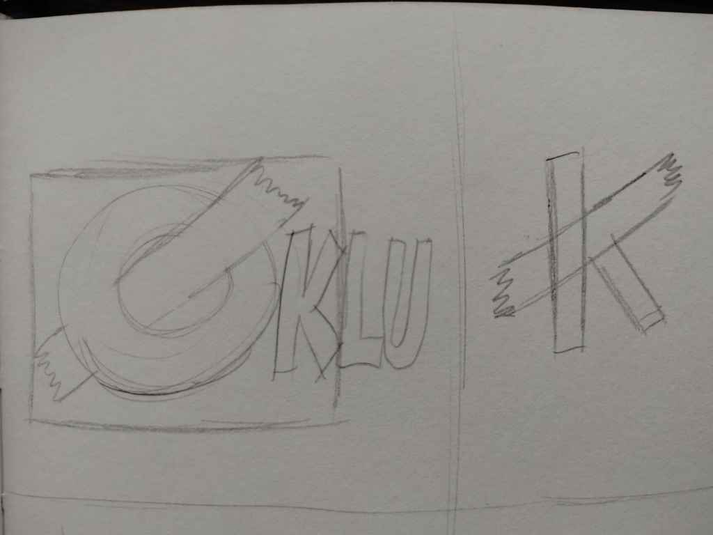
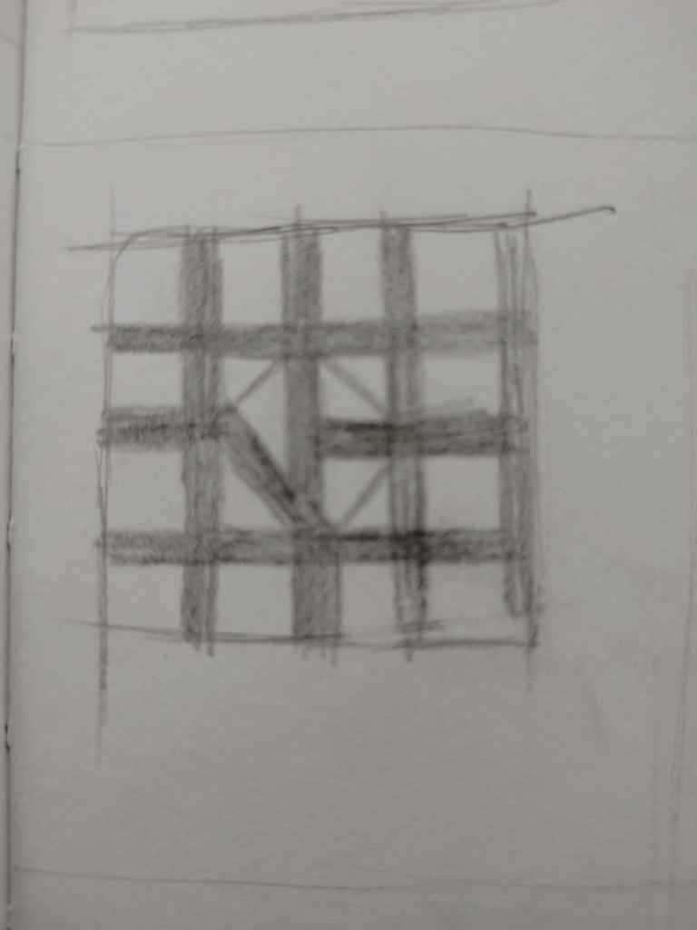
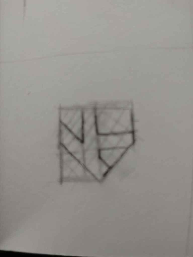
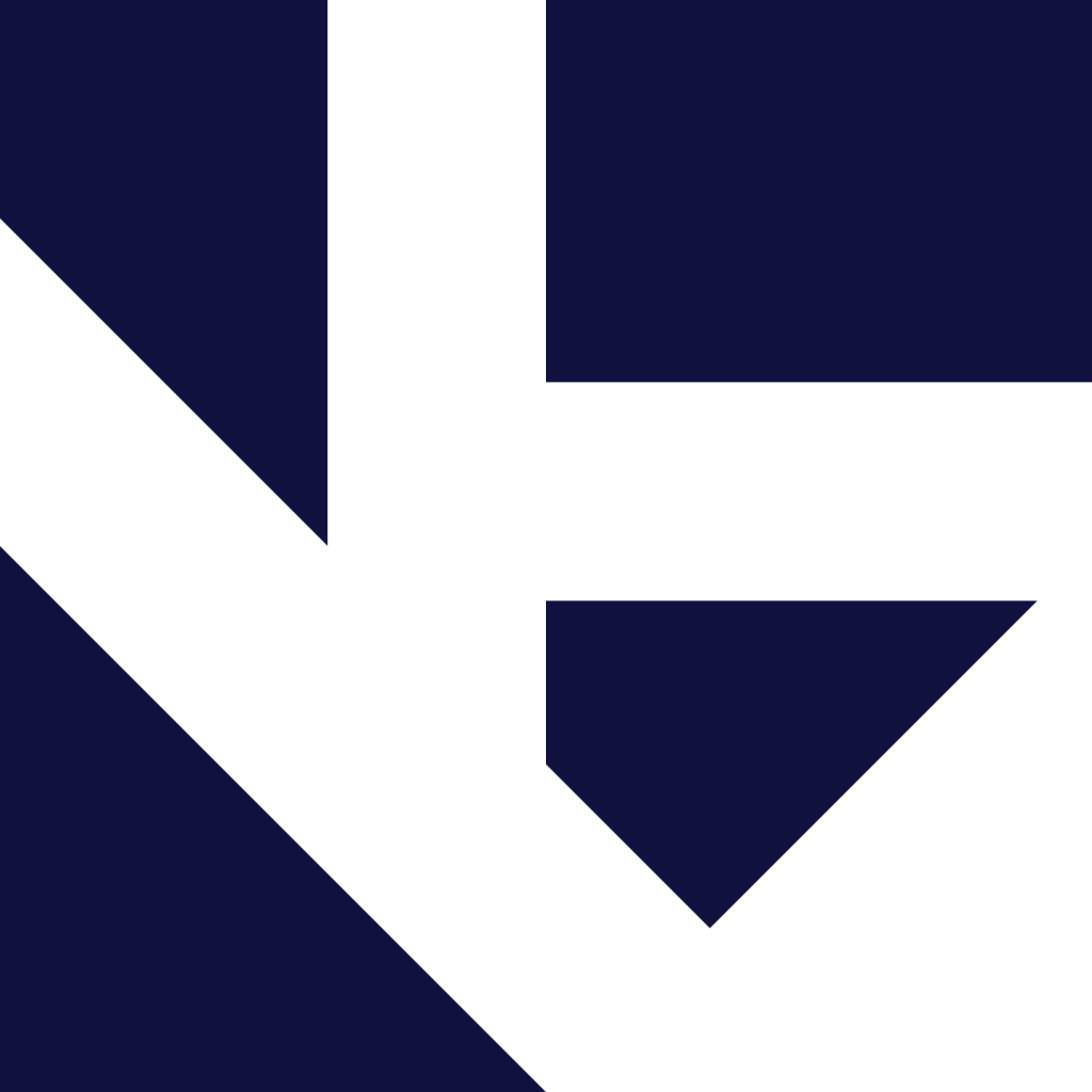
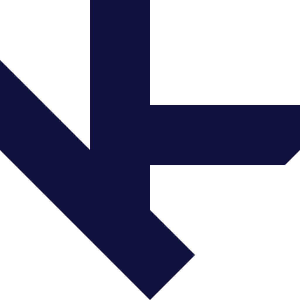
When it came to designing a logo, my first instinct was to continue playing off the roll of tape in the logo I was provided. In the sketches below, you will see I first tried to use the tape to spell out “OK”. It is a fun idea, but I felt it wouldn’t work well for a widely usable logo. My next idea was to take the tape and put it into the beginning of the wordmark by integrating it with the “K” but felt the same. I then looked toward the examples I had seen, where the tape on the Apollo 13 CO2 machine caught my attention. I sketched out a box structure with a grid made of solid lines representing the tape, with some deviations and extra lines to create a “K” and diamond in the center. I liked this idea a lot more, but felt it was too complex and would not work in a small form factor. I focused in on the centerpiece, the “K” made of deviations in the tape, and removed everything outside of that. This left me with a “K” made of negative space inside of a square. I then started removing the lines which made the diamond, starting with the line which acted as the baseline for the “K” shape. Instantly, I spotted that this made a diamond (jewel) shape toppled on its side, which would symbolize a higher quality of work while retaining the playful and imperfect nature of the previous iterations. This was the design I took into Adobe Illustrator. The final step was adding color, where I chose a deep navy blue over the black in the original logo. I chose this because navy blue is a significant color to the person behind Kludge, and because of the color’s association with sophistication and professionalism. My intention with the color association was to hammer home that even if the work isn’t perfect, it is still held to a high standard and you will be ensured a quality product.